
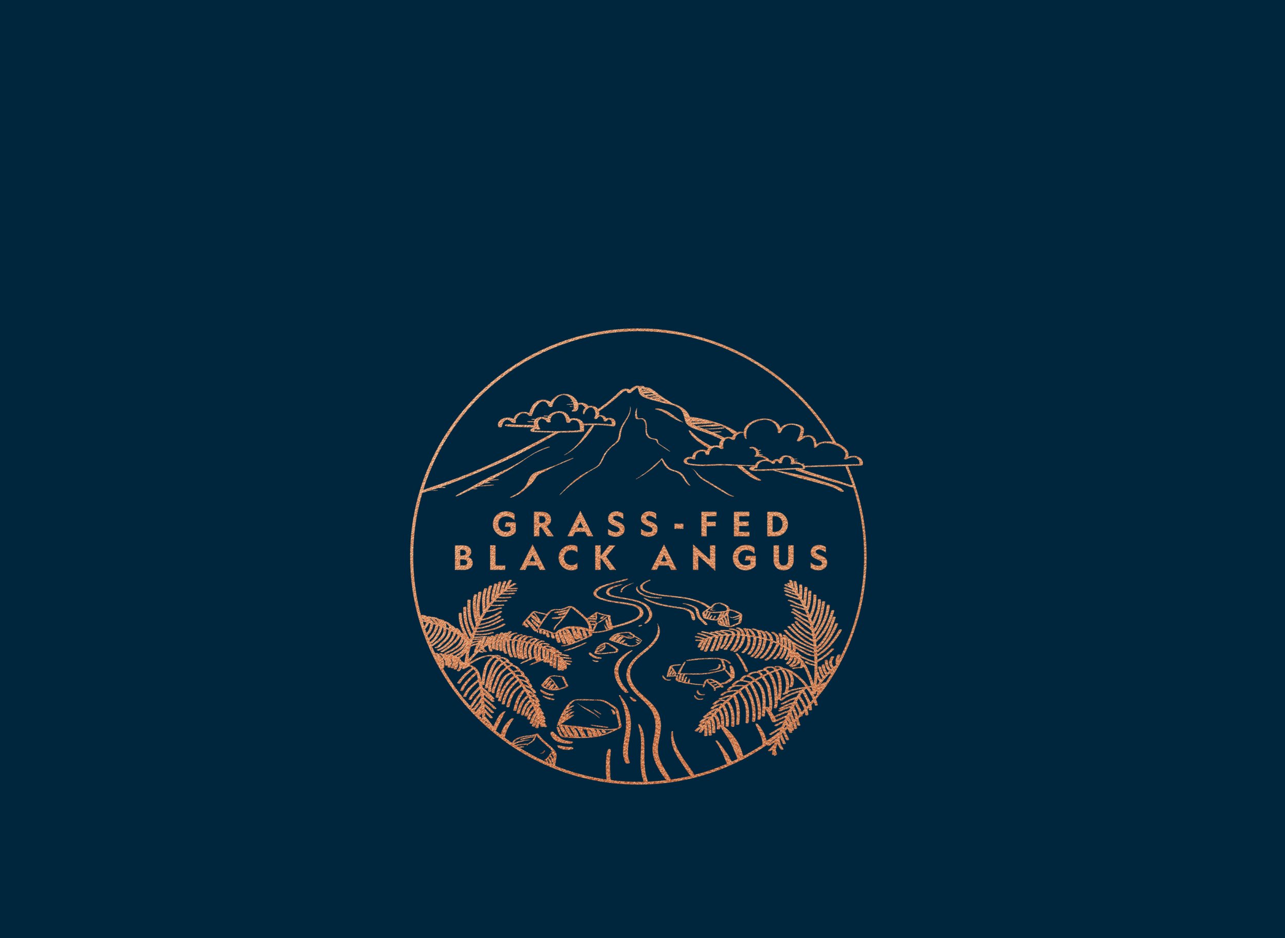
Stony River Black Angus Icon Design
Design - Illustration
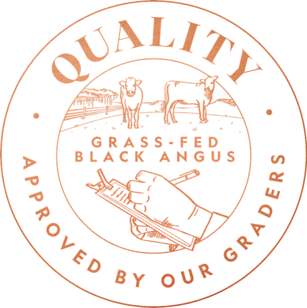
Stony River Black Angus, a sub-brand of ANZCO Foods, needed three distinct icons to represent their brand pillars: Provenance, Quality, and Taste. The challenge was to create icons that stood out from those of another ANZCO sub-brand, Maimoa Lamb, while still aligning with Stony River's unique identity.
Starting with the initial mock-up from the design team, I created the illustration, ensuring it was both visually impactful and scalable across various applications. After refining and securing approval for the 'Provenance' icon, this design became the template for the remaining icons. I completed the draft design for the remaining two icons, and the project was then passed on to the illustrator for completion. The final set of icons successfully captured the essence of Stony River Black Angus's brand pillars while maintaining a distinct look from their other sub-brands.


Final three designs:


-
Design: Enhanced the initial mock-up from the design team, transforming it into a refined and scalable design that aligned with the brand's aesthetic.
Illustration: Played a crucial role in the development of the 'Provenance' icon, ensuring it met client expectations and served as a template for subsequent icon designs.
Collaboration: Worked closely with the designer, illustrator, and client service team to ensure that the final icons effectively reflected the brand pillars of Provenance, Quality, and Taste.
-
Adobe Creative Suite
Illustrator
At: Q Brand Builders 2023